Ten down, twenty to go
This week: Working on my October challenge & knowing when it's time to take a break.
I'm going to do a bit less talking this week, because I want to give myself a break. More on that later. For now, pictures of art!
What I made this week
Quick pause to celebrate that I've finished 10 pieces out of the 30 I have planned for my October mini art challenge! Yay!
The only other art I worked on this week was taking a photo walk to the nearby pond with my good camera. Naturally, since I had a zoom lens camera capable of getting not-terrible photos of it, the great egret I have seen there twice did not make an appearance. Instead I took lots of photos of the fall leaves with the afternoon light shining through, one of my favorite things to photograph. I don't have any edited ones to show you today, and I don't know that I produced anything portfolio-worthy, but it was nice to go out with my camera for the first time in a while and enjoy the woods at golden hour.
With that aside, here's a rapid fire list of the 6 new pieces I made this week:
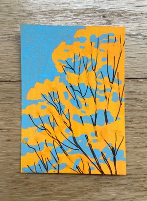
#4. Drawn from life of the treetops out the window. I laid down the yellow first to keep it bright and then painted the blue sky on top, a trick I've seen oil painters use in landscapes.
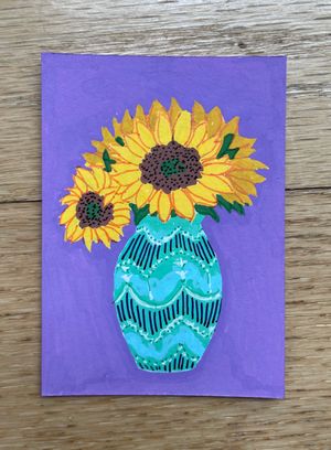
#5. Sunflowers, featuring a vase I bought from Savanah Conrad (pots.by.sav). I need to get my hands on a light brown fineliner, because I don't like how the orange looks here, but it was fun to use pens to capture the slip trailed texture on the vase.
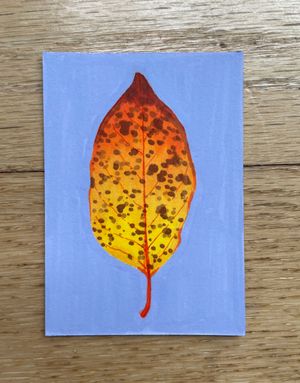
#6. A fall leaf, probably my favorite piece yet! I used alcohol markers to get the soft gradient and then blocked in the solid background with an acrylic marker last.
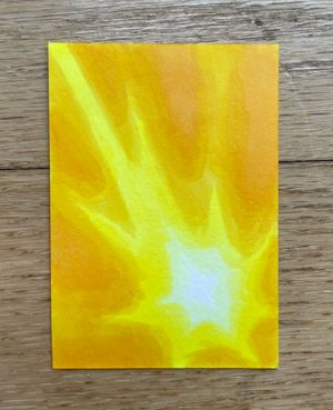
#7. I thought it would be fun to revisit the "light"-themed artist trading cards that I made this summer, but with alcohol markers instead of acrylic so I could get a smooth gradient. I really like the glow effect.
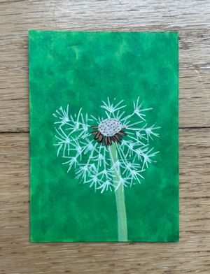
#8. From a photo of a dandelion I took a while ago. I think I tried too hard to copy the photo and forgot to focus on things like contrast and composition.
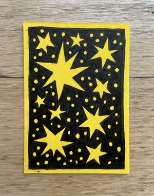
#9. I felt like I was getting stuck in realism so I switched to something very flat and graphic. It was fun but next time I'd like to do something more interesting with it.
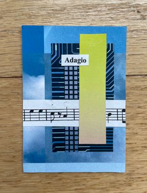
#10. Pulled out my collage supplies to force me to stop being perfectionist about drawing. I like this little abstract composition. The background is cut from a misprinted copy of my "blue sky" zine.
As you can maybe tell, I was getting a bit frustrated with what I was producing towards the end. The thing about experiments like this is that the results are rarely "perfect," and I could tell I was holding myself to an unfairly high standard and being disappointed. I bounced around to a few different mediums trying to find something that would feel better, and eventually had to call it quits for the week instead of working on more.
Not an amazing note to end the week on, especially when I was aiming to catch up a little on my late start. But I do get to celebrate being a third of the way to my goal, and there's plenty of time left. At times the best thing to do is acknowledge that I'm not in the right state of mind (sometimes for reasons that have nothing to do with art) and take a break.
What I'm thinking about
Sometimes you can just tell it's time for a break, and I hit that point the other day while working on my art. I was getting increasingly unhappy with it and could tell I wasn't being fair to myself.
So: Time to step away for a bit and take care of myself. For that reason, this is a short entry. I'm planning to clear my to do list for the weekend and relax, so I can come back to my art with clear eyes.
And if you have any handy, today would be a great day to send me some cat pictures or equivalent fun/silly things. Just saying. (Because of the way this newsletter works, btw, you can reply directly to the email. Don't worry, it won't go to the whole list.)
What's next
When I get back to working on art, I might need to lower the stakes a little. One of the ways I do that is to make something "bad on purpose." Use bad paper or un-erasable pens, scribble around a little, forbid myself from planning, and just make something with the expectation that it will look messy and terrible. It's very freeing and I highly recommend it as an anti-art-block measure for anyone with my type of perfectionism brain.
So, next week, a bit of terrible art and then hopefully some more mini October artworks to show off to you. Perhaps some more collages or abstract mixed media, to keep my brain in that playful space.
Until then,
Maggie